Note : This is not Photoshop. This is 100% coding and I've been using this to create title effect for my blog.
The CSS3 text-shadow property has been around for some time now and is commonly used to recreate Photoshop’s Drop Shadow type shading to add subtle shadows which help add depth, dimension and to lift an element from the page. This isn’t all the text-shadow property is capable of though, by getting creative and playing around with the colours, offset and blurring we can create some clever and pretty cool text effects!
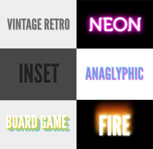
Check out the six text effects of vintage/retro, inset, anaglyphic, fire and board game in the demo, then copy the code snippets below to use the effects in your own designs. Needless to say you’ll need a text-shadow supporting browser (Safari, Chrome, Firefox) to see them in all their glory.
How text-shadow works
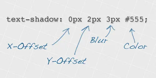
The text shadow CSS property is used to add shading to any text related HTML element. The syntax includes figures for the X-offset, the Y-offset, the blur amount and finally the colour of the actual shadow. What’s more, you don’t have to settle with one shadow, you can build up multiple text-shadow values to create some really cool effects!
Vintage / Retro text effect
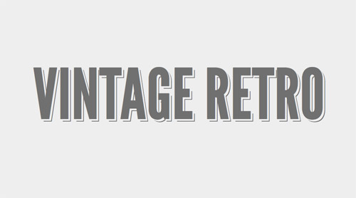
text-shadow: 5px 5px 0px #eee, 7px 7px 0px #707070; How it works:
The vintage style text effect is made up of two text shadows, but the first is set to the same colour as the background in order to give the impression that the second shadow (the thin dark grey one) is offset to the bottom right. Remember to make sure your first shadow colour is set to the same colour as your page background, and the text and second shadow also both use the same colour.
Neon text effect
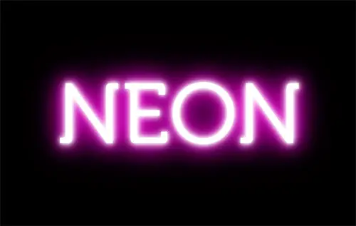
text-shadow: 0 0 10px #fff, 0 0 20px #fff, 0 0 30px #fff, 0 0 40px #ff00de, 0 0 70px #ff00de, 0 0 80px #ff00de, 0 0 100px #ff00de, 0 0 150px #ff00de; How it works:
The neon text effect is made up of 8 levels of shading. The base text is given a white fill, then each of the 8 text-shadow values are given larger and larger blur amounts while also getting darker. This blends between a vivid white inner glow and the large purple outer aura.
Inset text effect
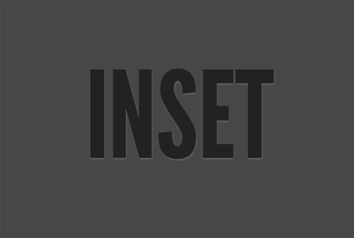
text-shadow: 0px 2px 3px #666; How it works:
The inset or letterpress style text effect is one of the more common uses of text-shadow. The shadow is offset on the Y-axis by a tiny amount to give the impression of a subtle highlight. On dark backgrounds offset the shadow underneath the text with a light colour, whereas on light backgrounds offset to the top of the text with a darker shadow colour.
Anaglyphic text effect
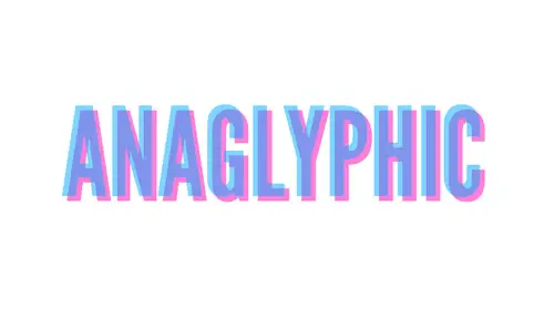
text-shadow: 8px 8px 0 rgba(255,0,180,0.5); How it works:
The anaglyphic text effect recreates the cool effect used on old 3D images. The effect is recreated with CSS using a mix of text-shadow and RGBa colouring. Using RGBa on the text and the shadow allows the alpha channel to be set to 50% transparency so the underlying text is visible through the shadow.
Fire text effect
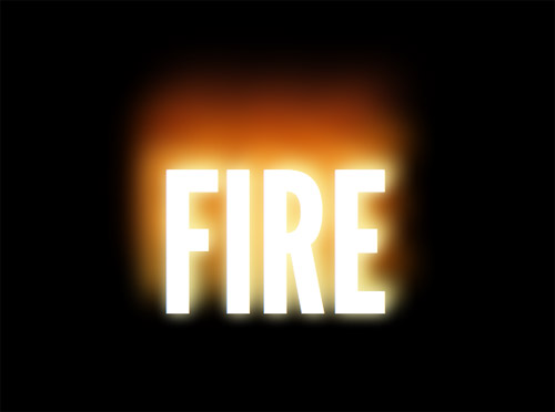
text-shadow: 0 0 20px #fefcc9, 10px -10px 30px #feec85, -20px -20px 40px #ffae34, 20px -40px 50px #ec760c, -20px -60px 60px #cd4606, 0 -80px 70px #973716, 10px -90px 80px #451b0e; How it works:
The fire text effect is another style that uses multiple levels of shading. Each shadow is offset in different directions, uses various blur settings and blends a range of warm colours to create the impression of a flame. These colours span from bright whites through to yellows, oranges and darker amber tones.
Board Game text effect
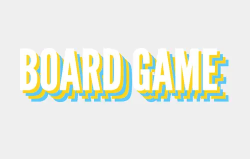
text-shadow: 10px 10px 0 #ffd217, 20px 20px 0 #5ac7ff, 30px 30px 0 #ffd217, 40px 40px 0 #5ac7ff; How it works:
The board game text effect simply uses multiple shadows each with an increasing amount of offset from the original text to create an alternating series of colours. No blurring is used to keep the shadows crisp and sharp as exact reproductions of the original text.

 »
»


1 komen:
Hotels near casino, poker and lounge at Casino - Mapyro
Casinos Near Casino · 제주도 출장마사지 MGM Grand Hotel Casino and Spa · Wynn Hotel & Casino 전라북도 출장안마 Las Vegas · Bellagio Resort & Casino 통영 출장샵 · Las Vegas Hotel & Casino · The Venetian Las Vegas · The 동두천 출장안마 Cosmopolitan of 구미 출장마사지 Las
Post a Comment